After the analysis of 3 different issues of the Shutterbug photography magazine it was evident that their masthead remains generally unchanged throughout their issues. The title and the font of the title remain unchanged and only it’s color changes at times. On all issues viewed, just above the title, there is what is called the special report, which is meant to tell the reader what they can expect to find inside the magazine. This text, however, is not always labeled as “Special Report” and at times just says what is happening in the magazine. For example the April 1st 2017 issue drops the “Special Report” and simply says “The internets most popular photographers tell us the secrets to their success”. Normally, such as in the September 1st issue of 2017, the section is named Special Report and is one of the few things that changes from issue to issue.
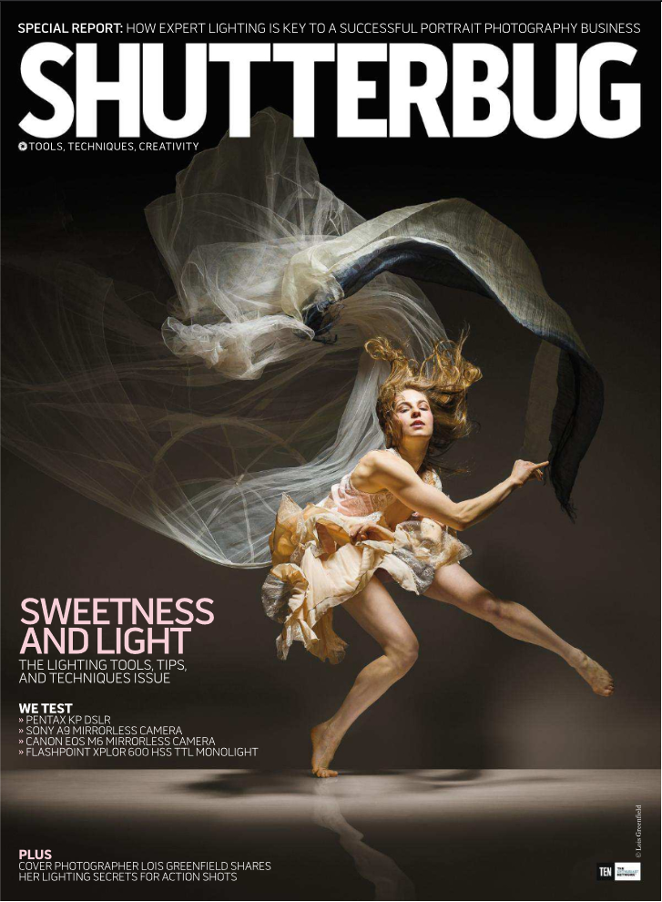
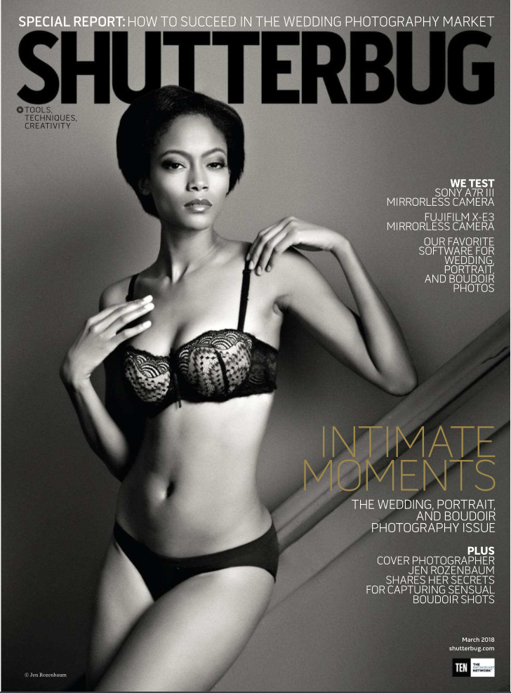
One of the other parts of the magazine that changes is the placement of the cover lines, as they switch from left to right. The color of the cover lines also changes from time to time, as seen respectively on the March 1st 2018 cover and the September 1st 2017 cover. In the March cover the words “Intimate Moments” is in a yellow color to contrast the dark background but it is a subdued mustard yellow so as to not overpower the cover image and in the September cover the words “Sweetness and Light” are in a pink rosy color and match with the warm background to create a welcoming but beautiful cover.
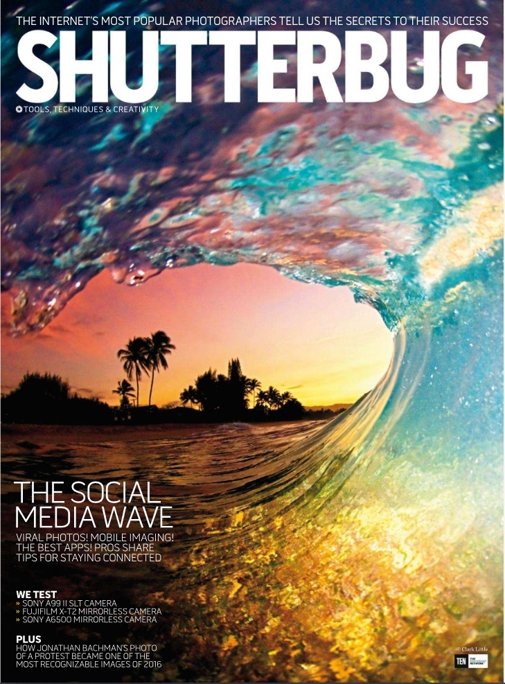
Out of the changing parts of Shutterbugs issues, the most varied would have to be the covers. The cover photo can vary from people, such as in the September 1st issue of 2017, to shots of natural scenery such as in the April 1st issue of 2017. This constant change of cover photos however is not uncalled for, as this magazine is a photography magazine. Due to the nature of the genre of the magazine versatility is to be expected with the cover photos.
Shutterbug is an exemplary magazine when it comes to the subject of versatility. I believe that this is a key aspect when creating my own magazine, as versatility is an indicator of well put together and sheer numbers of content. However, as Shutterbug does, I believe that presentation is not everything and that organization also plays a key role in the acceptance of the audience.


Comments
Post a Comment